
WEAREX
As population density increases and new viruses appear, we are becoming more aware of the need to protect ourselves from pathogens. However, the efficacy of surgical masks is questionable and reusable antimicrobial masks are uncomfortable and undesirable.
WEAREX is a brand of garments utilizing the same cutting-edge textile treatments used in reusable antimicrobial masks to prevent the inhalation and spread of viruses and bacteria without having the look or feel of traditional medical accessories.
product process
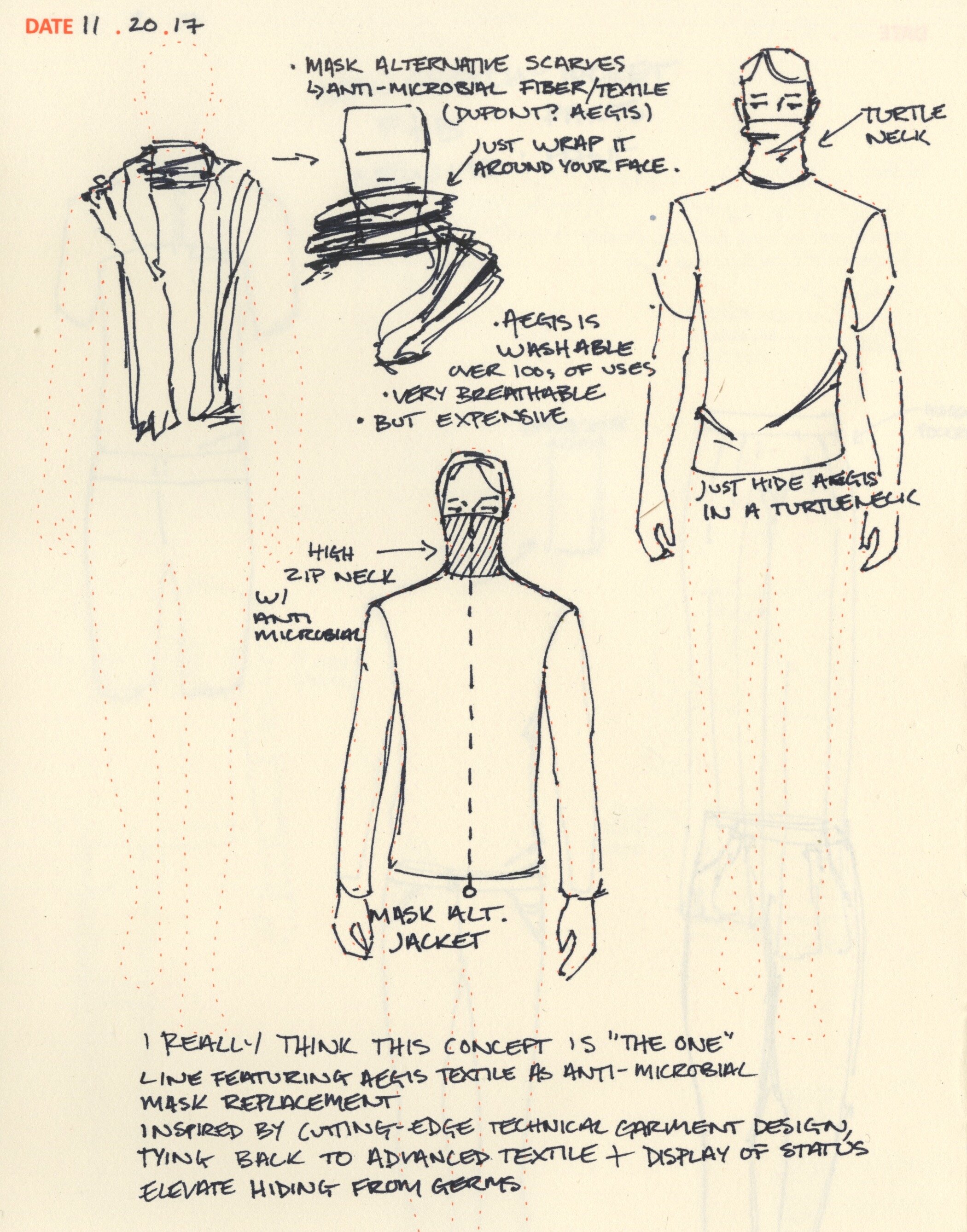
The prompt was to create a hyper-practical technical product for urban living. I found a gap in the market for antimicrobial protection for anyone outside of the medical community. I wanted to take the function of protection from pathogens and make a desirable product, something that nobody would look at and think “that looks medical.”
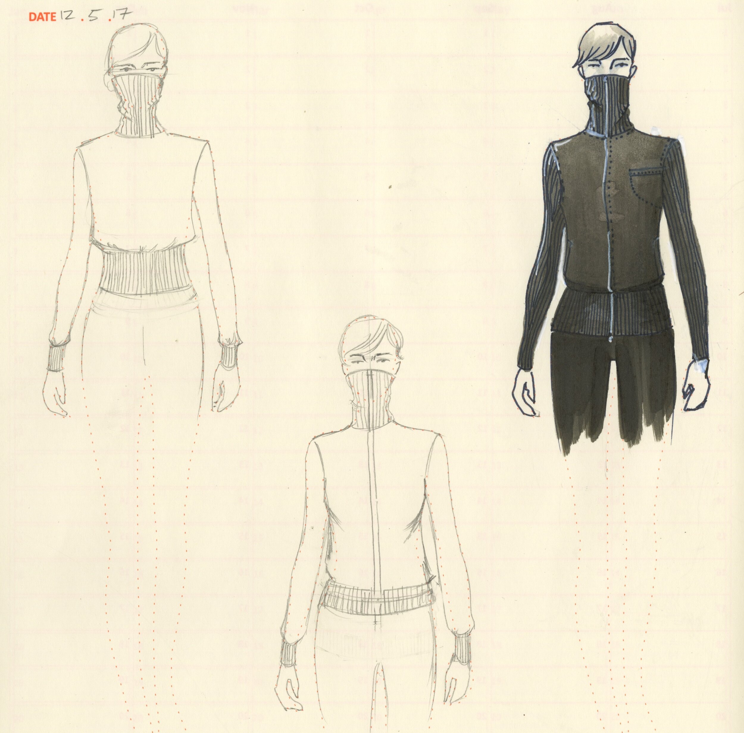
I finalized the jacket design, drafted patterns, prototyped, and produced the final product as a team of one. The neck is lined with the same fabric used to make medical-grade antimicrobial masks, sandwiched between layers of a soft, luxe merino jersey. On its own, merino wool is antimicrobial and reduces the need for frequent washing, further preserving the textile treatment inside.

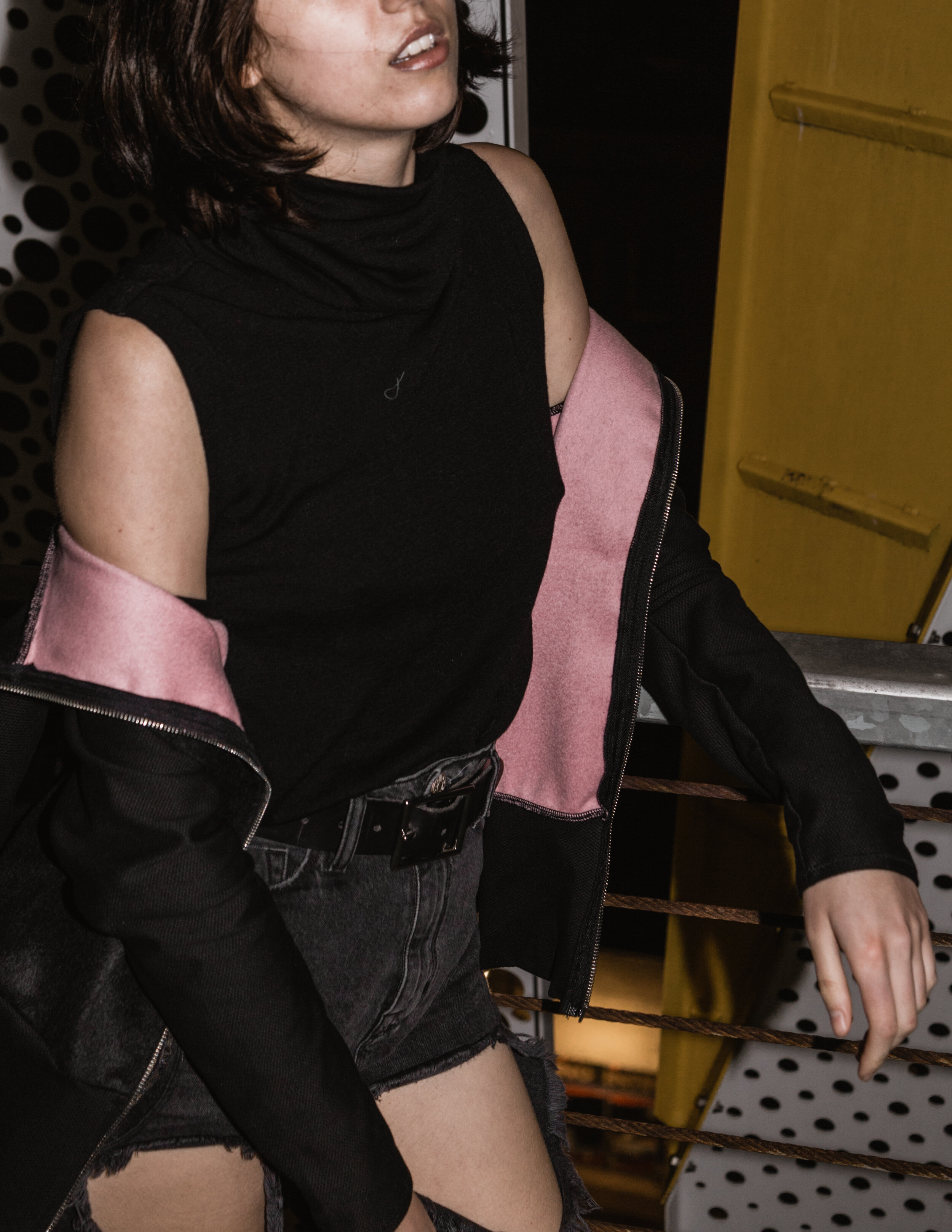
The final product, including the functional merino funnel neck companion piece. The sweater underneath contains the exact same treatment, and is also made of merino. Worn with the funnel neck down and the jacket unzipped, WEAREX garments have absolutely no indication of their protective function. They are comfortable, minimally designed, technical garments with urban practicality at the forefront of all choices made in their design and construction.
brand process

The first thought I had for the design of the brand was “protection.” Early concepts were based around elements of protective symbols from various cultures, with a focus on runic symbols and strong angles.
However, I did not believe that this was in line with the technical aspects of the product and quickly began iterating through dozens of typefaces. This was helpful for setting the tone for further design on the project, including the logo and packaging design that came next in the process.

After finalizing the choice of typeface, I went to work on the logo. I still wanted to convey a sense of protection and draw on that runic influence, but to do it in line with the style of the garments- minimal, clean, contemporary.
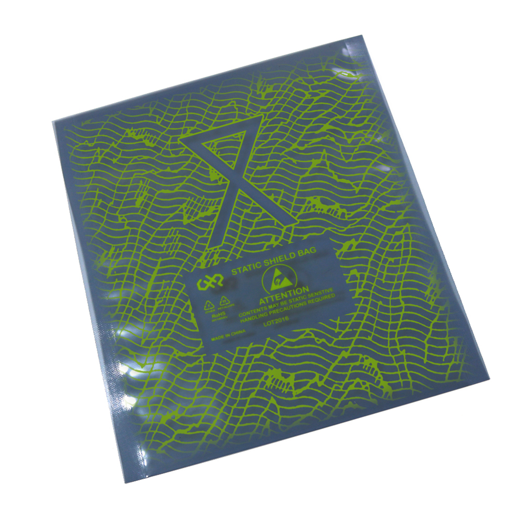
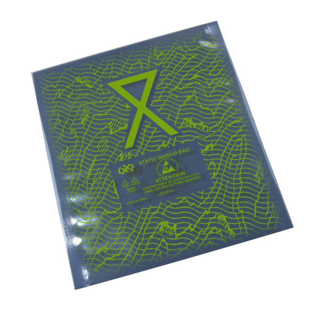
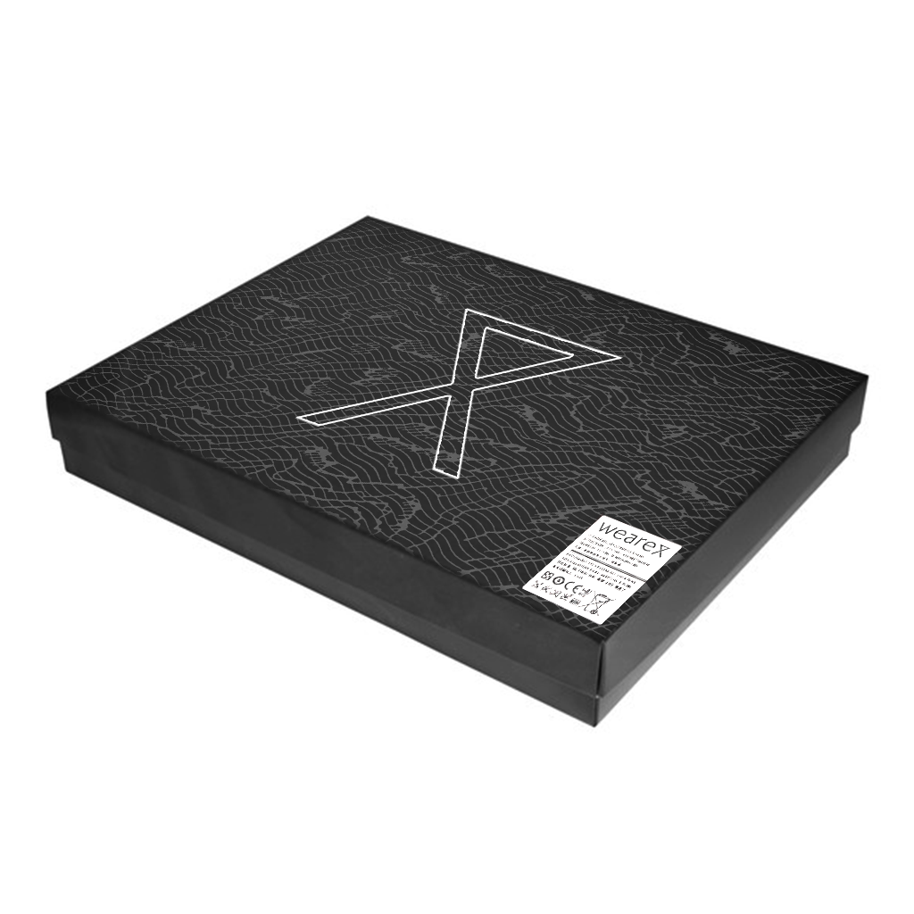
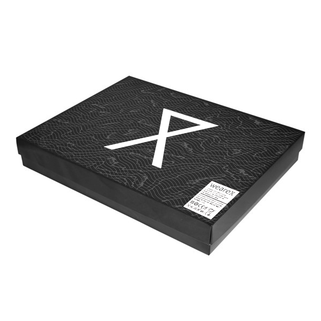
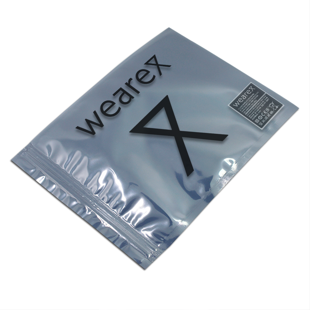
This logo design was carried across all associated branded content, including these packaging concepts. There was a need for two types of packaging- bags for storage or retail, and boxes suitable for shipping. Several of the designs feature security patterning, drawn from anti-tamper envelopes, and the bags chosen are anti-static. This is for the purpose of emphasizing these garments as secure, technical items- far more than your average sweater.

The last piece of the puzzle was direction of a shoot to best display the product itself, along with some speculative design for potential advertisements. The intention was to make a product with a medical purpose into something that was not only appealing but desirable, indicative of the taste of the user and the lifestyle that they live. I believe this goal has been achieved.